In order to understand better the use of lights in
filming, myself and 3 other media students created a small production involving
a dark room using our own lighting.. By doing this we encountered several
issues which we understood could potentially pose issues during our real
production on location such as the battery life of the camera. After a short
amount of time, approximately 30 minutes, the batteries for the camera died,
which helped us understand the importance of fully charging them before taking
them on location. If they were to die on location before we finished shooting,
we would be forced finish early, so we will remember to always be aware of the
short battery life. We also learned the importance of the backlight. This
secondary light to the main light provides depth to the shot which is vital in
achieving a good picture. Lights are essential when filming indoors. The use of
colour lights are also effective in setting the mood of the production.
Showing posts with label research and planning. Show all posts
Showing posts with label research and planning. Show all posts
Thursday, 29 January 2015
DANCE SCENE INSPIRATION
We have been trying to find inspiration for our dance scene. This scene from skins incorporates all of the elements we want to employ:
- A claustrophobic environment - through people dancing and intermingling together
- Saturated colours, most importantly reds and blues
- Moments of clarity as characters are introduced, e.g. the continued shots of effy dancing - highlighting her presence = what we want to do with our key characters.
- The use of strobe - again creating a chaotic environ
- Slo- mo used, producing an alien environment
Wednesday, 21 January 2015
Tuesday, 20 January 2015
SETTING IDEAS - WALKING HOME SEQUENCE
For the same reasons as stated in the 'exiting the club' sequence setting, I knew I would have to find locations in and around Wandsworth.
For the first part of the walk homewards, I felt it would be best to use the actual road on which the 'club' they had came from was, mostly because it made shooting slightly easier and since we were going for the more 'grungey' look instead of high end Chelsea clubs, I thought the fact that it was a semi-residential road wouldn't really matter.
The final scene, revolves around an alleyway within which one of our main protagonists is captured. For this we obviously needed a pathway that was:
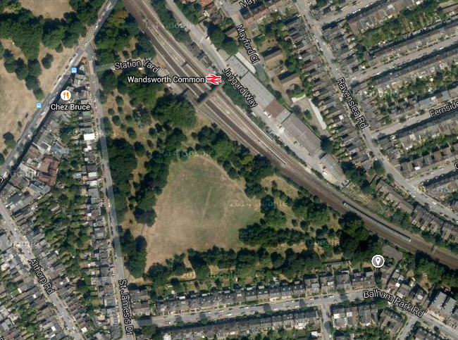
 I subsequently did a recce in in which I narrowed my choices down to 3 alleyways in my area, and with the help of Blake and Emma we decided on one which was very close to Wandsworth Common overground station. On the map pictured, it shows the alleyway jutting off from Balham Park High Rd. We chose this particular alleyway because it was very well lit, was sufficient in length and due to the train station being so near, made it easy for us all to get to. I have included a picture I took which shows the high walls (creating an imposing feel to the scene we will subsequently shoot), good lighting (from the two lamp-posts), and perfect length.
For the first part of the walk homewards, I felt it would be best to use the actual road on which the 'club' they had came from was, mostly because it made shooting slightly easier and since we were going for the more 'grungey' look instead of high end Chelsea clubs, I thought the fact that it was a semi-residential road wouldn't really matter.
The final scene, revolves around an alleyway within which one of our main protagonists is captured. For this we obviously needed a pathway that was:
- well lit
- long enough in length for other girls to exit and Helena still be left on the phone
- not in a dangerous area (carrying around v.expensive equipment)
- average-looking, nothing glamourous, just a run of the mill cobbled alleyway
- and of course, in an area which was relatively easy to get to
 I subsequently did a recce in in which I narrowed my choices down to 3 alleyways in my area, and with the help of Blake and Emma we decided on one which was very close to Wandsworth Common overground station. On the map pictured, it shows the alleyway jutting off from Balham Park High Rd. We chose this particular alleyway because it was very well lit, was sufficient in length and due to the train station being so near, made it easy for us all to get to. I have included a picture I took which shows the high walls (creating an imposing feel to the scene we will subsequently shoot), good lighting (from the two lamp-posts), and perfect length.
PROTAGONIST PROFILE
From just our opening, the character roles are relatively ambiguous.

The main character present within these two minutes is:
- Unnamed girl at beach with whom the film opens - played by Anna Schofield
I think the main influence for this particular character, our main protagonist, would be Effy from Skins, played by Kaya Scodelario.
From the opening, the viewer understands this female as someone who was friends with the victim of the kidnapping. We wanted her to seem:
From the opening, the viewer understands this female as someone who was friends with the victim of the kidnapping. We wanted her to seem:

- --> dishevelled, an outcome from the 'night before' which we would subsequently cut to
- --> dressed as if she were on a night out
- --> heavy eye makeup, as is common for characters like Effy
- --> we would have wanted the character to smoke but we didn't feel right our actress to as a non smoker
CHARACTER INSPIRATION
- CHERRYBOMB, described by IMDB as a film where 'Three teens have a wild weekend of drinking, drugs, and stealing that quickly spins out of control.' Because this is one of my favourite films, I have been heavily influenced by it. Released in 2009, it is a grimy drama that centres around two boys (Malachy played by Rupert Grint and Luke by Robert Sheenan) attempting to win the same girl's affections by outdoing eachother on a wild ride of sex, drugs, vandalism, shoplifting and fighting.
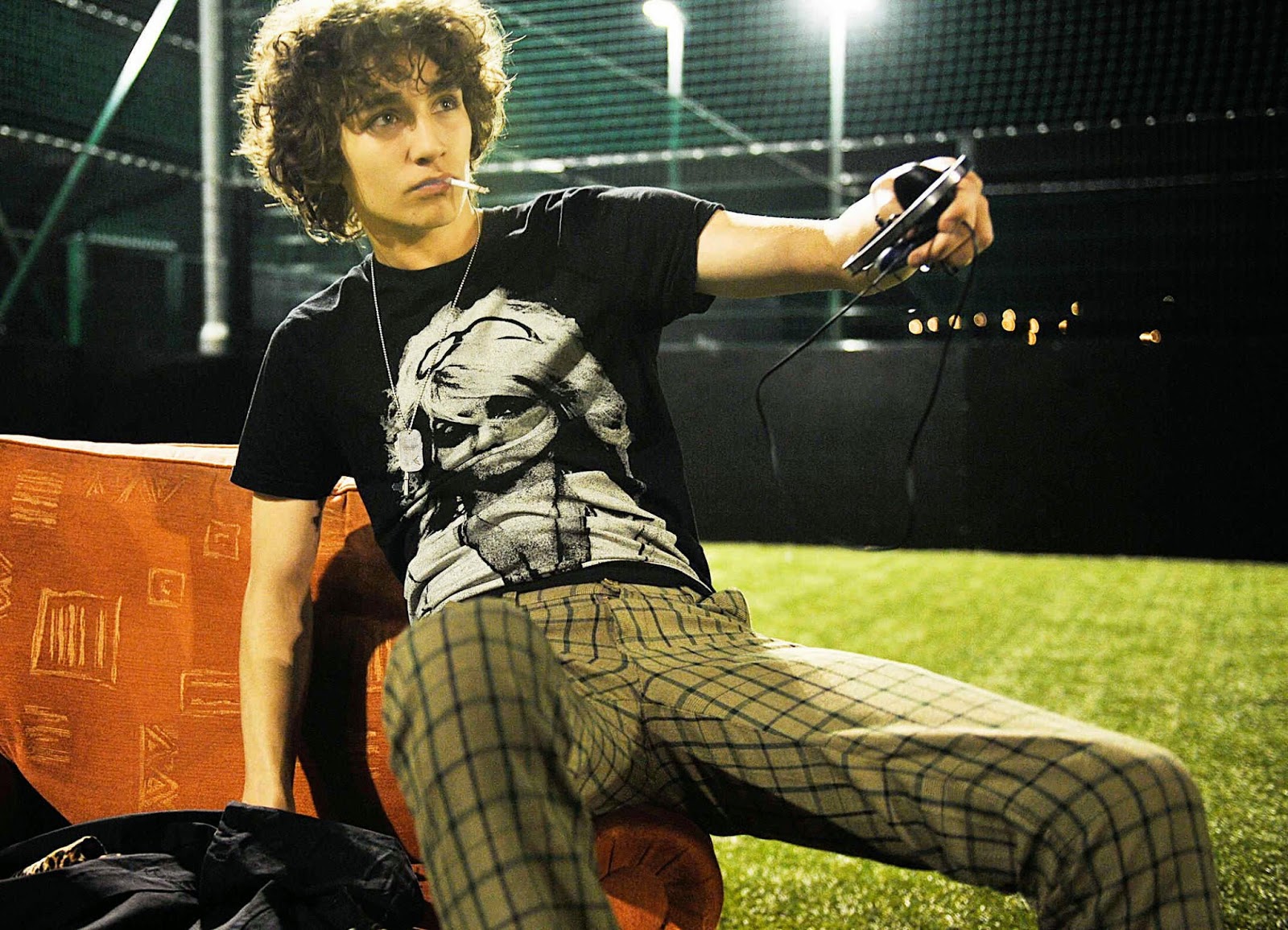

- GLUE - T.V. SERIES, a new E4 drama described by radio times as 'Skins meets Broadchurch'. I think the main reason this was such an inspiration was because of the series' plot - a murder mystery. Although it is set in the countryside it includes many of the themes of young urban life, parties, drinking, drugs and amicability - which is especially portrayed within the first five minutes of episode 1 - pictured.


- SKINS, a British T.V drama that started in 2007, following the lives of a group of teenagers living in Bristol as they battle controversial story lines like dysfunctional families, mental illness, adolescent sexuality, drug abuse, death and bullying. I think Skins relates to what we are trying to produce in our opening, especially in the second series which features Kaya Scodelario. The grimy, darker quality of the programme as well as it being set in an urban environment.

Monday, 19 January 2015
DANCE SCENE MUSIC
Knowing we wanted a deep house track for our dance scene, we were influenced by many songs including:
We felt this song was
This is another darker house beat we thought would go well with the 'sense of foreboding' we wanted to achieve in our scene.
Here is a dance beat from the different genre of music - drum and bass.
We felt this song was
This is another darker house beat we thought would go well with the 'sense of foreboding' we wanted to achieve in our scene.
Here is a dance beat from the different genre of music - drum and bass.
Wednesday, 7 January 2015
ANIMATIC
STORYBOARD
Here is the storyboard I have drawn out. Only the shots for the beach scene were actually drawn prior to filming, as we thought it would be nearing on impossible to draw all the .05 of a second long shots within the club scene. So, for the latter and the walking home sequence I have picked out the key shots and drawn them in the way that we wanted them to be portrayed.


Friday, 12 December 2014
FILM NOIR INFLUENCES
FILM NOIR is a cinematic term used to describe Hollywood crime dramas, particularly those that highlight cynical attitudes and sexual motivations. The classical film noir period is regarded as extending from the early 1940s to the late 1950s. Its associations are with low key lighting and black and white visual style that stems from German expressionist cinematography. Many of the stories and much of the attitude of the classic noir has roots in the school of crime fiction that emerged in the US during the Great Depression.
Film noir is one of the main inspirations for our coursework. Pictured is a screen grab from the Big Combo, a 1955 American film noir directed by Joseph H. Lewis.

Film noir is one of the main inspirations for our coursework. Pictured is a screen grab from the Big Combo, a 1955 American film noir directed by Joseph H. Lewis.
This scene depicting the silhouetted figures of Diamond and Susan in the fog is considered to be one of the most iconic images of film noir. We have taken direct inspiration here for our final scene shot in the Clapham alleyway. Here, by only seeing the silhouettes there is a complete sense of ambiguity. For our coursework we want to achieve a complete sense of mystery surrounding the man walking down the alleyway towards the girl. We will do this through dressing him in a way that covers him sufficiently, e.g. a hat covering most of his face, as well as utilising the already low lighting that will be present in the alleyway.
FILM TITLE IDEAS
This is a title I have created using the application Motion. Here, I have chosen the word 'Strobe' and made it flash across the screen in a glowing font. Although I made this clip very fast - I think it is relatively easy to see the word in the short time, and because of its bright, neon colouring it has the effect of the word burning in your mind.
This is a second version I have made:
Here, I chose to make the letters come up one by one on the scree, using the same neon font.
This is a second version I have made:
Here, I chose to make the letters come up one by one on the scree, using the same neon font.
Monday, 8 December 2014
GRAPHICS IDEAS

As our film is a psychological thriller, we drew inspiration from the title of Se7en, by David Fincher, for our graphics. This title is dynamic due to its simplicity yet distorted effect. The title is a sans serif font, but then is distorted to blur the edges and it is mirrored behind it. It's as if the title is mirrored behind to relate to the meaning of the film, se7en- seven times.
We then wanted to try this type of creepy font on our own graphics. As we've be considering the title of our film to be "Blackout", we tried this on dafont.com to see how it would look. However, after trying these, we were less sure on the overall effect of them. They felt more like your typical horror/thriller title and we wanted to convey an almost scary simplicity in the title.
We then wanted to try this type of creepy font on our own graphics. As we've be considering the title of our film to be "Blackout", we tried this on dafont.com to see how it would look. However, after trying these, we were less sure on the overall effect of them. They felt more like your typical horror/thriller title and we wanted to convey an almost scary simplicity in the title.

When exploring graphics, art of the title was very useful when
looking for inspiration for our film. It collates the opening scenes of many
popular films and TV series and shows them as stills. This allowed us to see a
visual medium to try to work out what we would like to convey though the font.
artofthetitle.com also writes about the background of the film, and has the
productions studios reasons to the style and choice of their opening title
sequence.


From the first time i
watched American horror story, i was immediately impressed by the iconic
opening sequence. This sequence is replayed at the beginning of every episode
and so need to be memorable and convey the horror shown in the series. Even
though we do not need to make opening credits, i found the site very useful in
terms of inspiration for graphics for our title and the way we might portray
our opening.

From looking at multiple film graphics, we realised that we wanted to use a font that looked modern and edgy, yet if shown in the right context, (at the end of our thriller opening scene), would look terrifying. These were some of the titles we liked the most:

Basic Title

Mesmerize

Neou

Neou
Me and Emma have decided our favourite font for the title of 'Strobe' is Mesmerize, simply because Basic Title was too narrow and we hated the 'R' of Neou. However, the title 'Blackout' was suited best to Neou because we loved the thin quality of the lines and the simplicity. We think these choices will make a very clean title, especially if we are going to use effect and have it flash across the screen, flickering almost eerily like a strobe would.
Subscribe to:
Posts (Atom)